Table of Contents
- Quick answer: accent walls in a condo
- How do you choose which wall to accent?
- The accent-wall LRV math
- Eight condo accent wall colour ideas we trust (with LRV)
- Do accent walls work in a small condo?
- Pro tips for a high-impact accent wall
- A wall that transformed a unit, and one that did not
- Which Toronto buildings suit which accents?
- What finish should an accent wall be?
- What rules apply to renters and condo boards?
- What accent wall colours are trending for 2026?
- Ready for the right accent wall?
Quick answer: accent walls in a condo
An accent wall works in a Toronto condo when you paint the natural focal wall, the one your eye lands on first, and keep the other three light. Pick a solid, uninterrupted wall behind the bed or sofa, choose a colour that coordinates with your floor and furniture undertones, and finish it in eggshell or matte. Done right, one accent wall adds depth without shrinking the space. For the bigger picture, see our condo painting guide.
Key Takeaways
- Accent the natural focal wall: behind the bed, behind the sofa, the wall you see entering, or a fireplace/TV wall.
- Avoid walls broken up by windows or doors. The colour gets chopped into strips and the effect falls flat.
- In a small condo, one dark accent wall adds depth as long as the other three walls stay light.
- Our most-used Benjamin Moore accents: Hale Navy (HC-154), Newburyport Blue (HC-155), Kendall Charcoal (HC-166), and Ashwood Moss.
- Finish accent walls in eggshell or matte, never gloss. Confirm board and lease rules before you paint.
How do you choose which wall to accent?
The best accent wall is the natural focal wall, not just any wall you feel like painting. After years of painting Toronto condos, we have learned the eye picks a focal wall on its own the moment you walk into a room. Your job is to colour that wall, not fight it.
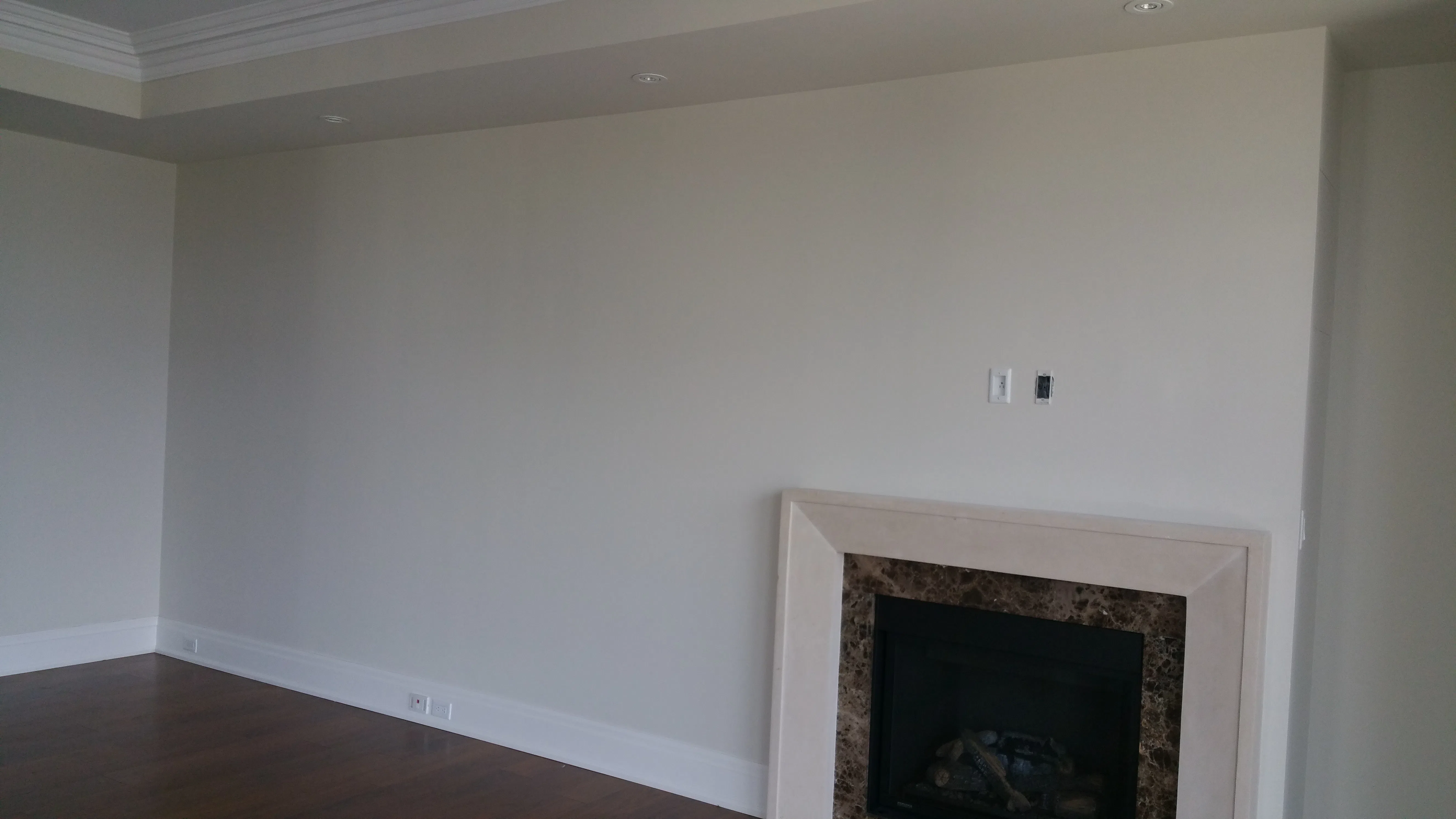
In a bedroom, the focal wall is almost always behind the bed. In a living room it is the wall behind the sofa, or the wall you face when you step through the front door. A fireplace or TV wall already anchors the space, so it makes a strong accent too. These walls carry weight visually, which is exactly what an accent colour is for.
What walls should you avoid accenting?
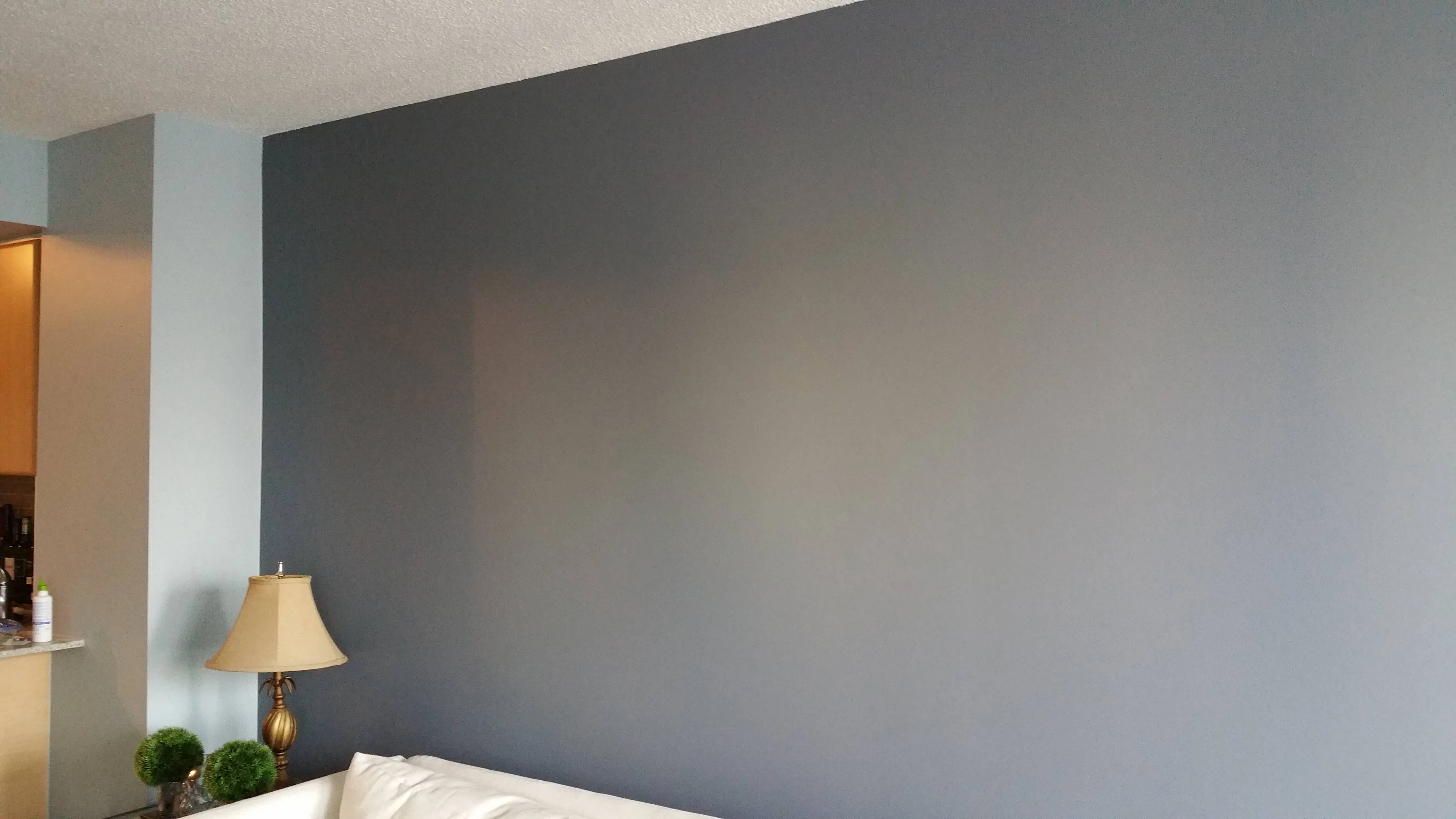
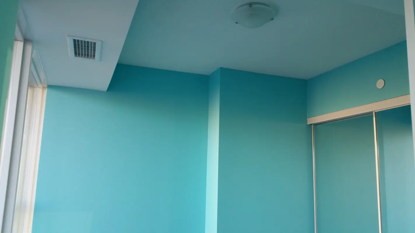
Skip any wall that is broken up by windows, doors, or a wide opening. When you paint a chopped-up wall, the colour gets split into thin, awkward strips and the depth you wanted disappears. We have repainted plenty of well-meaning DIY accent walls for exactly this reason. One solid wall, one room, one accent. Two competing accent walls usually cancel each other out and make a small condo feel busy instead of layered.
The accent-wall LRV math
How much darker should the accent wall be? The professional rule, anchored to Light Reflectance Value:
- Accent wall LRV must differ by at least 15 points from the main walls' LRV, or the contrast won't read as a deliberate accent and looks like an imperfect colour match
- Same-colour-2-shades-darker approach (5-15 LRV difference): tonal accent, subtle and modern. This is the 2026 trend replacing high-contrast accents.
- Different colour, 30+ LRV difference: dramatic accent. Hale Navy (LRV 6.3) against White Dove (LRV 85.4) gives a 79-point spread, which is maximum visual weight.
The contemporary direction in 2026 has shifted toward tonal accents (a deeper shade of the same colour family) rather than the bold-colour-against-white style that defined the 2010s. A White Dove (LRV 85.4) room with a Classic Gray (LRV 74.5) accent wall has only an 11-point spread, which reads as too subtle. A White Dove room with a Pale Oak (LRV 69.8) accent has a 15-point spread, which reads as deliberate but soft. A White Dove room with Hale Navy (LRV 6.3) is the classic dramatic spread.
Eight condo accent wall colour ideas we trust (with LRV)
Here are the Benjamin Moore paint colours we reach for most on Toronto condo projects, with LRV and where each one shines.
| Colour | Code | LRV | Undertone | Best room/use |
|---|---|---|---|---|
| Hale Navy | HC-154 | 6.30 | Grey-leaning navy, warm | Behind a bed or sofa — maximum drama |
| Newburyport Blue | HC-155 | 6.34 | Clean, cool true blue | Cool, modern living room |
| Kendall Charcoal | HC-166 | 11.95 | Warm-leaning dark grey | Behind a TV or framed art |
| Wrought Iron | 2124-10 | 6.16 | Near-black charcoal | TV or bedroom statement wall |
| Caliente | AF-290 | 6.99 | Warm red | Dining nook or entry wall |
| Salamander | 2050-10 | 6.41 | Near-black warm green | Dramatic bedroom feature wall |
| Ashwood Moss | AF-470 | 25.97 | Warm, earthy green | Bedroom or home-office — subtler accent |
| Chelsea Gray | HC-168 | 25.32 | Mid-tone greige | Renter or resale-safe accent |
| Pale Oak (tonal accent against white) | OC-20 | 69.79 | Warm greige | Subtle tonal accent on white-walled units |
The colours in the LRV 6-12 range (Hale Navy, Newburyport, Kendall Charcoal, Wrought Iron, Caliente, Salamander) are the dramatic-contrast options against a white room. The LRV 25 range (Ashwood Moss, Chelsea Gray) gives medium contrast, visible but less dramatic. The LRV 65+ options (Pale Oak, Classic Gray) are tonal accents, which is the 2026 direction for owners who want depth without the dramatic statement.
1. Hale Navy (HC-154)
Hale Navy is our most-requested accent, a deep navy with a touch of grey that reads refined rather than nautical. It pairs beautifully with warm wood floors and brass or matte black hardware. Use it behind a bed or sofa. It is forgiving, photographs well, and suits almost any room undertone.
2. Newburyport Blue (HC-155)
Newburyport Blue is a cleaner, brighter true blue that pops against crisp white trim. Choose it over Hale Navy when your space leans cool and modern, with grey floors or sleek furniture. It still has the moody depth of a navy accent wall without going too soft or grey.
3. Kendall Charcoal (HC-166)
For a charcoal accent wall, Kendall Charcoal gives you a rich, warm-leaning dark grey that feels like a gallery backdrop. It is excellent behind a TV or a wall of framed art. The warmth keeps it from going cold and flat under condo pot lights, which a true grey can do.
4. Wrought Iron (2124-10)
When you want a near-black charcoal, Wrought Iron deepens a Gray Owl scheme into something dramatic. It works as a TV feature wall or a bedroom statement wall, and it makes white trim and light flooring look razor-sharp by contrast. Use it sparingly: one wall, in a room with good light.
5. Caliente (AF-290)
Caliente is a warm, confident red for anyone who wants energy rather than calm. It suits a dining nook or an entry wall in a condo with warm wood and camel or beige furniture. Red is bolder than most condo accents, so commit it to a single solid wall and keep everything else neutral.
6. Salamander (2050-10)
Salamander is a near-black green, the bolder edge of the 2026 warm-green trend. It reads almost black until the light hits it, then the green comes through. We love it behind a bed for a dramatic, enveloping feel. Pair it with natural wood and warm metals to keep it grounded.
7. Ashwood Moss
Ashwood Moss and softer sage tones are the warm, earthy greens that have taken over from the cool greens of a few years back. They feel calm and modern against natural wood floors and linen-toned furniture. This is our pick for a bedroom or home-office accent when navy feels too expected.
8. Chelsea Gray (HC-168)
Chelsea Gray is a versatile mid-tone greige that gives you an accent wall without committing to a deep colour. It is the safe-but-stylish choice for renters and resale-minded owners. It coordinates with both warm and cool rooms and reads as intentional design rather than a bold statement.
Do accent walls work in a small condo?
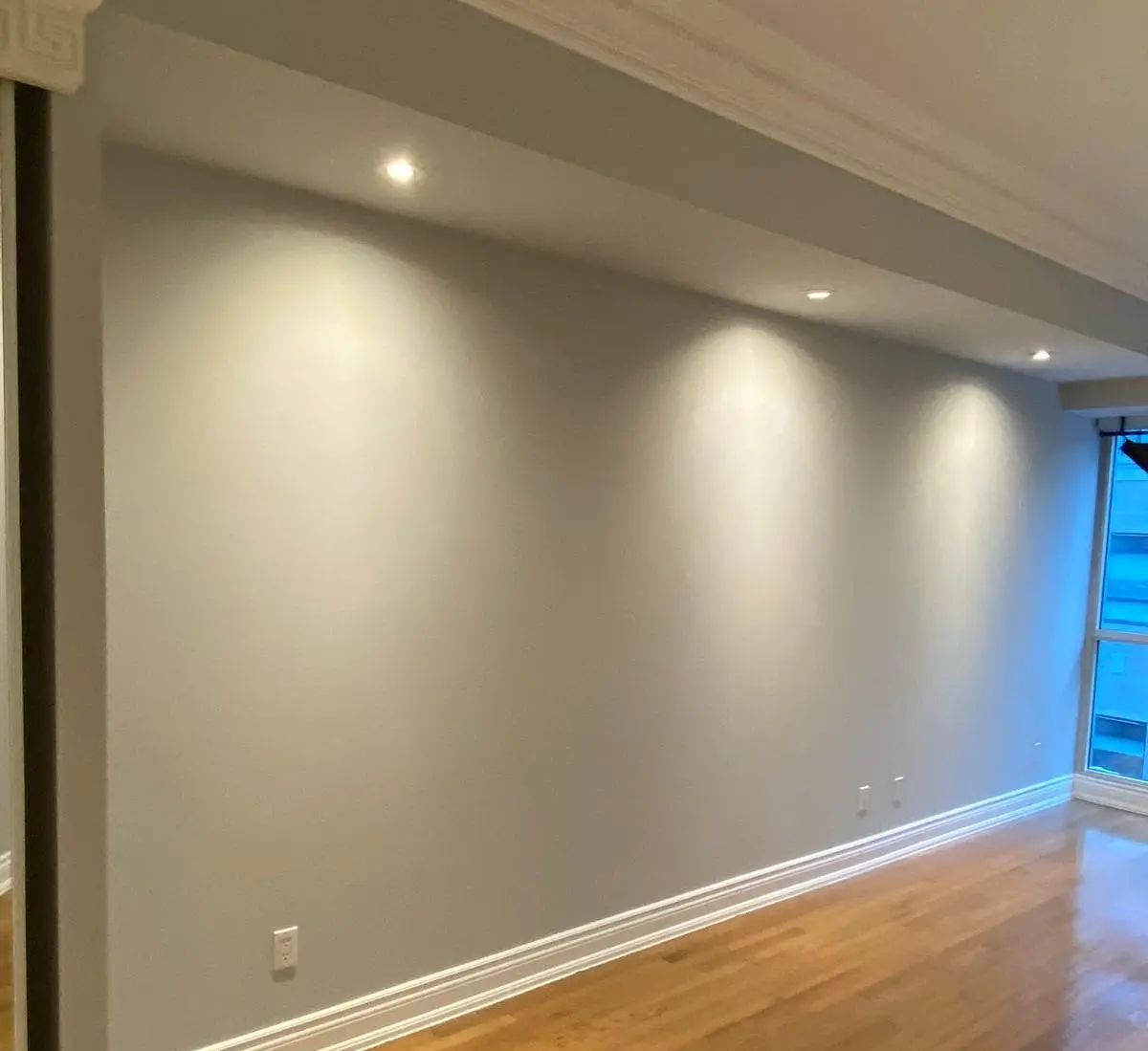
Yes, a single accent wall adds depth to a small condo as long as the rest of the room stays light. The fear that a dark wall shrinks a space is the most common myth we hear, and it is usually wrong. One darker focal wall makes a compact room feel deeper, because the eye reads the dark surface as receding.
The discipline is restraint. Keep your three other walls in a soft white or light greige, then let the focal wall carry the colour. If you want help choosing those base tones, we cover the best colours for small condos and picking your base white in detail. Where small-condo accents go wrong is painting two or three walls dark, or accenting a window wall so the colour frames the glare.
Pro tips for a high-impact accent wall
A handful of small decisions separate an accent wall that looks designed from one that looks like an afterthought. These are the habits we apply on every Toronto condo accent wall we paint, learned the hard way over years of jobs across the downtown core.
Pick the natural focal wall, not the easy one
Stand in the doorway and notice where your eye lands first. That is your focal wall. Painting the wall behind the bed or sofa rewards the way you actually move through the room. Choosing a wall just because it has the least furniture in front of it almost always lands flat.
Avoid walls broken by windows and doors
A wall chopped up by a window, a door, or a wide opening splits the colour into thin strips and kills the depth you were after. Hold the accent for a solid, uninterrupted surface. We have repainted plenty of window-wall accents that simply framed the glare instead of adding richness.
Coordinate with your floor and furniture undertones
The accent has to live with your wood floor and your biggest pieces. Warm wood and camel furniture pair with warm accents like Hale Navy, Caliente, or Ashwood Moss. Cool grey floors and sleek modern pieces suit Newburyport Blue or a clean charcoal. Match the undertone you already own and the wall reads intentional.
Use an eggshell or matte sheen
Keep the accent in eggshell or matte, the same low sheen as the surrounding walls. Gloss on a single wall only spotlights roller marks and drywall seams, and it makes deep colours look patchy under pot lights. Low sheen hides flaws and lets the colour do the work.
Keep the other walls light in a small unit
In a compact downtown condo, let one focal wall carry the colour and hold the other three in a soft white or light greige. That contrast is what makes a dark wall add depth rather than close the room in. Two or three dark walls in a small unit just feels heavy.
Sample before you commit
Test large swatches on the actual wall and look at them morning and night under your own lighting before buying a full can. A navy that looks perfect in the store can turn cold in a north-facing unit. Ten minutes with a sample pot saves a full repaint.
A wall that transformed a unit, and one that did not
The accent wall I think about most was a King West hard-loft with exposed brick and a concrete ceiling. We ran a charcoal accent on the wall beside the brick, and the dark paint framed the raw texture so well the brick finally looked like the feature it was meant to be. The owner told me the room felt twice as considered for the price of one wall.
The misfire was a CityPlace micro-unit where the owner wanted three walls in a deep navy. We talked them down to a single focal wall behind the Murphy bed, and that one wall added all the depth they were chasing without shrinking the space. Had we painted all three, that little glass-tower unit would have felt like a cave. One wall did the job.
Which Toronto buildings suit which accents?
The right accent depends as much on your building as your taste. Hard-loft conversions in the Distillery District and King West, with their exposed brick and poured concrete, can carry deep accents that smaller units cannot. The small glass towers of CityPlace, Fort York, and Liberty Village ask for restraint, where a single focal wall does the most work.
In a brick-and-beam loft, a charcoal or Hale Navy wall beside the masonry plays off the texture and the tall ceilings without overwhelming the room. The raw materials want a partner with weight. In a compact glass-tower unit with floor-to-ceiling windows and white walls, one deep focal wall behind the bed or sofa adds depth while the light from the glass keeps the space open. Same colours, very different application, decided by the bones of the building.
What finish should an accent wall be?
Use eggshell or matte on the accent wall, the same low sheen as the surrounding walls. Despite the popular advice to make an accent wall glossier, a higher sheen on one wall only highlights roller marks, drywall seams, and surface flaws, the last thing you want on the wall everyone looks at.
Matte and eggshell hide imperfections, read rich, and let the colour do the work. Deep accents like navy and charcoal especially need a low sheen, because gloss makes dark colours look patchy under pot lights. The only place we step up the sheen is trim and doors, which we run in satin or semi-gloss regardless of the wall colour.
What rules apply to renters and condo boards?
Accent walls are almost always allowed, but confirm your lease and condo board rules in writing before you start. Most Toronto rental leases permit painting if you return the unit to its original colour at move-out, so budget for a prime-and-repaint under any repaint-on-move-out clause. A single accent wall is cheap and quick for a professional to reverse.
Most condo corporations permit interior accent walls because they are not structural, but a quick check with property management saves headaches later. Get the okay first, then enjoy the wall.
What accent wall colours are trending for 2026?
For 2026 the three directions we are applying most are moody blues, warm earthy greens, and charcoal. Moody navies like Hale Navy still own the bedroom feature wall. Warm greens such as Ashwood Moss have replaced the cooler greens of recent years and feel grounded against wood. Charcoal walls, built from Kendall Charcoal or Wrought Iron, give a dramatic backdrop for art and TVs.
What ties 2026 together is warmth and depth over the cool greys of the late 2010s. We always coordinate the accent with the undertones already in your floor and furniture, so the result looks intentional rather than trend-chasing.
Ready for the right accent wall?
A great accent wall comes down to two decisions: the right wall and the right colour, both matched to your space. If you want a hand getting them right, book a free quote and we will walk your condo, test colours under your own light, and back the work with our 5-year workmanship warranty. For everything from prep to finishing, read the full painting guide next.
Chad Saygili is co-owner of Condo Painters Pro, a Toronto condo painting specialist. He has spent years painting condos across Toronto and the GTA, works exclusively with Benjamin Moore, and backs every job with a 5-year workmanship warranty.
MORE ABOUT OUR TEAM →